Not Your Grandma’s Gold
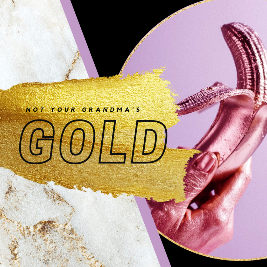
Gold is timeless for branding, and the modern-day application of it is definitely not your grandma’s gaudy gold. We’ve consistently seen the rise of this trend over the years, and frankly, it’s not going anywhere. From delicate accents to elevate a brand’s sophistication to bold eye-catching metallics front and center, gold takes the cake. This versatile trend isn’t the easiest to implement, so Grandma, put your spectacles on and read carefully!
Gold, Not Yellow
Let’s start with the biggest pain point designers face – gold doesn’t mean yellow. Achieving gold in your branding isn’t an easy task, and we highly recommend professionals (ahem, nice to meet you) to take on this challenge. When looking through different examples of gold in branding, you’ll likely notice the heavy presence of photography, images and textures used. Recreating gold in design can easily turn flat and simply appear yellow, with no hint of metallic. If you’re desperate to try it yourself, we’ve found that a web-friendly version of gold can be achieved using the hex code #D4AF37 or RGB value of 212, 175, 55. You can check out some hex code examples here.
Read the Room
While we love to rave about the beauty of gold in design, it has to speak to your audience to work well. Gold has often been a signifier of wealth and extravagance, glamour and beauty, even optimism. Just as all of these attributes can be inspirational and eye-catching, if overdone, they can quickly be internalized as greedy, excessive, and materialistic. Finding that sweet middle ground is likely where you want to be. Particularly with the state of the world today – using gold in an understated and delicate fashion will likely land the best, but of course, it all depends on your audience.

Less is More
Using gold sparingly might be the single best advice we can give. An overuse of gold can actually cheapen the look of the design, and ultimately your brand. Pairing delicate lines of gold with muted and modern palettes and graphics will give a timeless and luxurious feel, without taking things too over the top. A small dose of gold is a fantastic way to give your products a little extra-something-something (you know what we mean). One of our favourite examples of branding and packaging we created for a client is The Haven Project. You can read more about the luxury & modern branding we did here.
What Goes with Gold?
It’s not just a question for your wardrobe, but understanding how to mix and match gold is imperative to graphic design. First and foremost, it depends on what type of colour scheme will guide your project. Here are some examples:
- Complementary – This type of colour scheme would use the complementary colours of gold: blues & purple blues, greens & violets. These are what we would commonly refer to as jewel tones, a highly popular colour combination with gold.
- Monochromatic – Using a monochromatic gold colour scheme can use the entire range of pale gold to dark, antique gold to create an entirely gold colour palette.
- Duochromatic – An extremely common colour scheme with gold is duotones, utilizing gold and a secondary, muted colour such as grey.
- Triadic – A triadic gold colour scheme includes red and blue, as they are equidistant from gold on a modern colour wheel.
If gold speaks to your brand, but you don’t want to get into the intricacies of designing it – let us do the leg work! You can book your hour-long, complimentary consultation here.

