
This year we embarked on a journey through the top design trends of 2021. We carefully selected trends that were being heavily utilized for UX, UI, social media, websites, and branding. Each month we did a deep dive on our social channels, carefully creating and curating graphics that portrayed the design concepts. If you didn’t happen to see the entirety of the collection, we wanted to share with you a high-level overview of this past year. Of course, if you want more, take a browse through our 2021 blog posts to get a more in-depth look at each trend. Or… just scroll.
Dark Mode
Dark Mode took the UX and UI worlds by storm this year. Besides the obvious cool factor of being dark and moody, this trend excelled because its fonts and elements stand out significantly more on a dark background, increasing the accessibility for sight-challenged people. While this is a good enough reason alone, there were a few more that caught our eye. Dark mode is great for captivating the attention of users, easy on the eyes (literally), and saves the battery life of your phone or tablet.
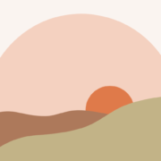
Natural Design
Natural design originally made its way into web design via eco-conscious brands. However, it made its way into the top trends of 2021 since growing in popularity across different industries. The natural imagery, calming colours, and soothing fonts aren’t just for eco-friendly companies anymore. Due to the pandemic, the past two years resulted in more of us spending more time indoors and on screens. It’s no wonder we wanted a more soothing and natural user experience online, bringing the outside in.
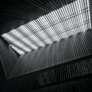
Monochromatic Minimalism
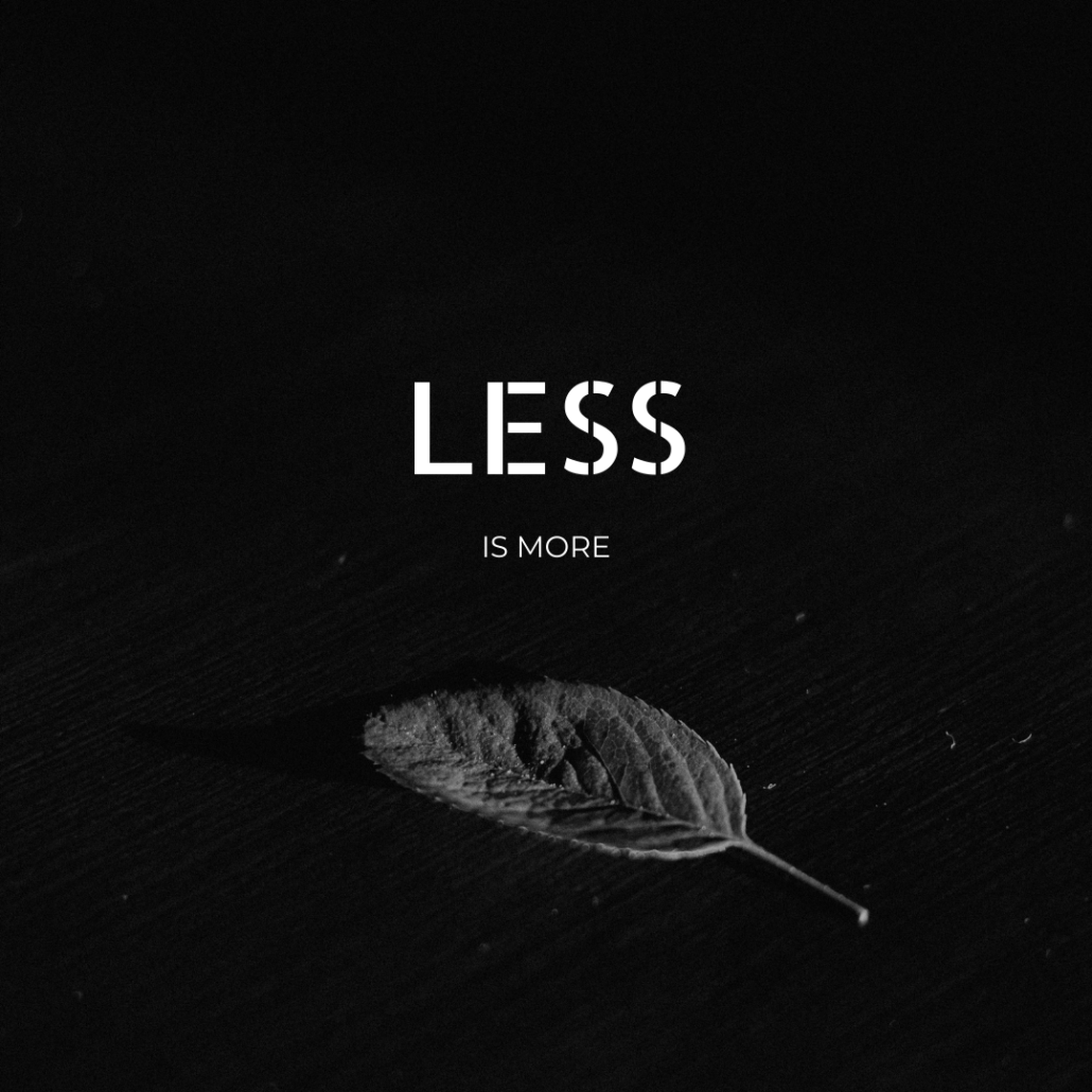
Monochromatic Minimalism was the cleanest design trend we highlight this year. While this style of graphic design isn’t new, over 60 years in the making, we’ve seen a huge growth in its presence today. The increased use of monochromatic minimalism in design is possibly a reflection of what users are desiring more in their own lives: simplicity. We found that not only does this speak to users, but when there’s less visual information vying for the user’s attention, what does remain has more of an impact.
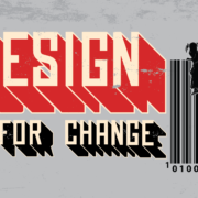
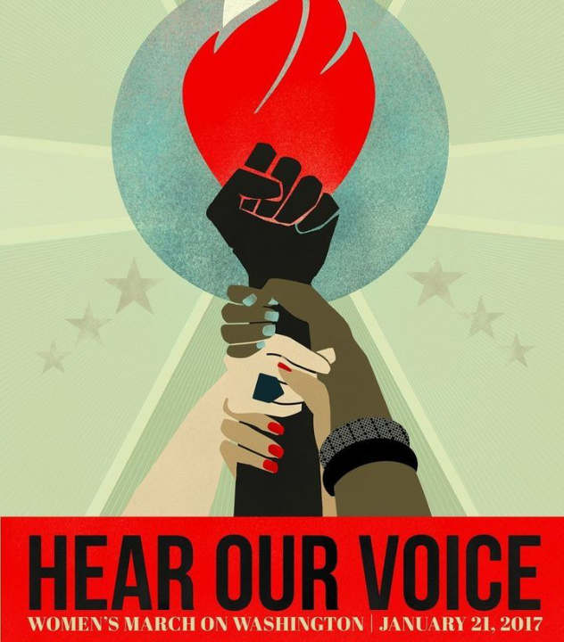
Socially Conscious Design
Socially Conscious Design has been one of the most powerful design trends in recent years and had an incredibly strong presence in 2021. This design trend focuses on showing solidarity and support for social, environmental, and justice issues through graphic design. Essentially, it is artists using their talent and voice to promote the betterment of society. The need for social and environmental change has reached a tipping point in recent years, and creators and brands have stepped up to the plate to show support and create awareness.
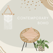
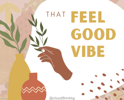
Contemporary Boho
Contemporary Boho is a modern twist on Bohemian style. While bohemian style is known for opulence and excess, in current graphic design, the trend is dialled back a bit – accented with clean, modern lines, fonts, and empty space. The combination of the flowery excess of the bohemian style with modern touches can result in visually stunning and appealing graphics.
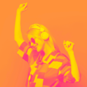
Duotone & Colour Monochromatic
Duotone & Colour Monochromatic has become more and more popular in recent years, and we have loved the resurgence of this throwback. This design trend implements a simple palette, but with a strong presence. This style of branding is creative, eye-catching, and customers love it.
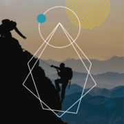
Geometric Design 
Geometric designs have been at the forefront of design trends this year and have the staying power to be around for years to come. The clean appearance of geometric shapes, coupled with the subconscious psychology of shapes, creates impactful graphic designs that connect with clients. You can learn more about the psychology behind the shapes here.
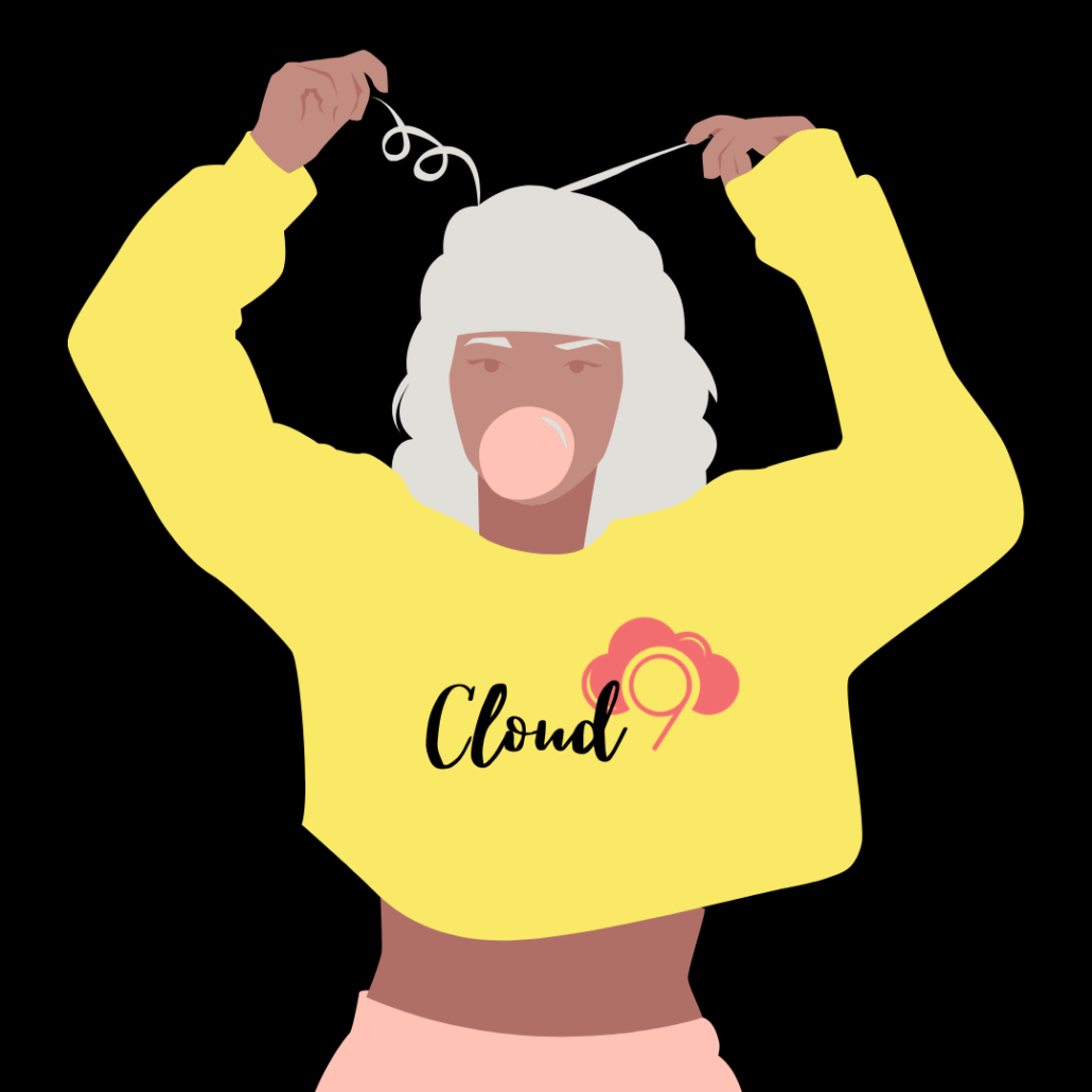
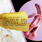
Gold
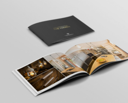
While gold has been a timeless design trend, it definitely worked its way into the ranks of the top design trends of 2021. We’ve consistently seen the rise of this trend over the years, and frankly, it’s not going anywhere. From delicate accents to elevate a brand’s sophistication to bold eye-catching metallics front and center, gold takes the cake.
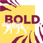
Bold Design
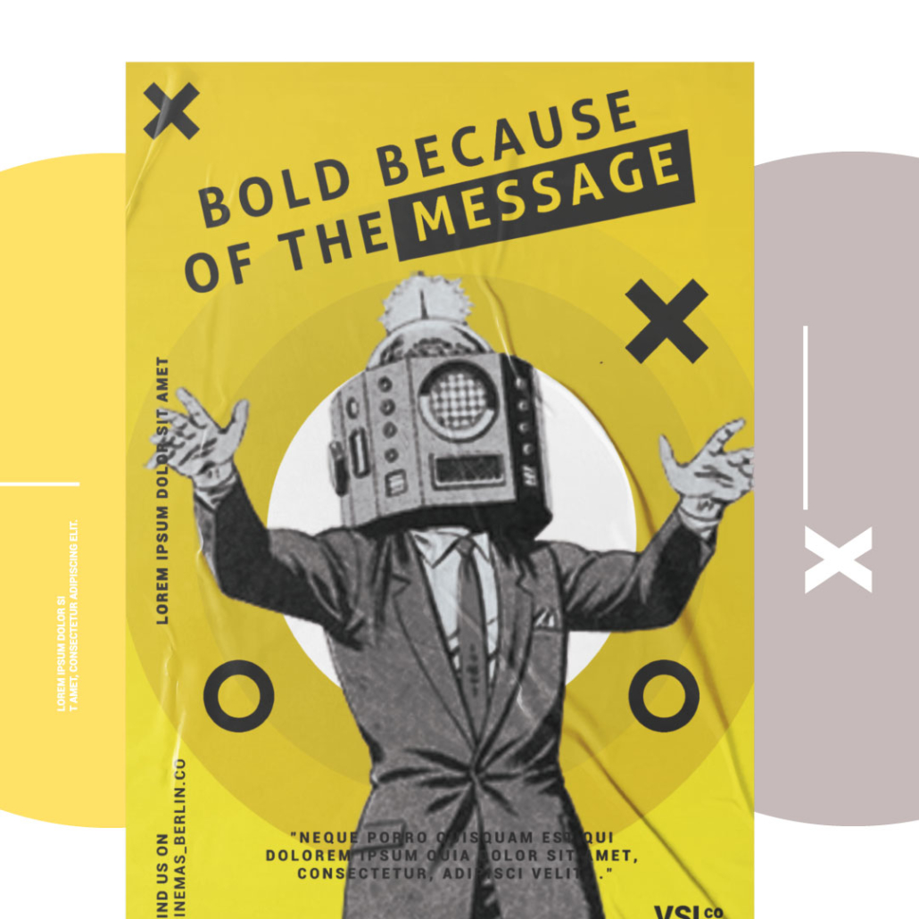
The striking design trend of bold design stepped into the spotlight this year. Bold design is a multi-faceted design concept – it can be your messaging, colourway, typography (or absence thereof), graphics or photography. Bold Design isn’t simply eye-catching graphics or typography – the essence of bold design is captivating creatives and tactics that not only catch the eye of the user but hold their attention.
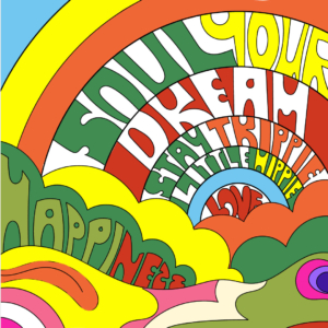
Typographic Chaos
Typographic Chaos might be the most symbolic trend for this past year. It perfectly embodies the chaotic nature of 2021, but at the same time, provides beauty, creativity, and inspiration. This trend breaks all the rules, and we couldn’t love it more.
