Paint It Black With Dark Mode
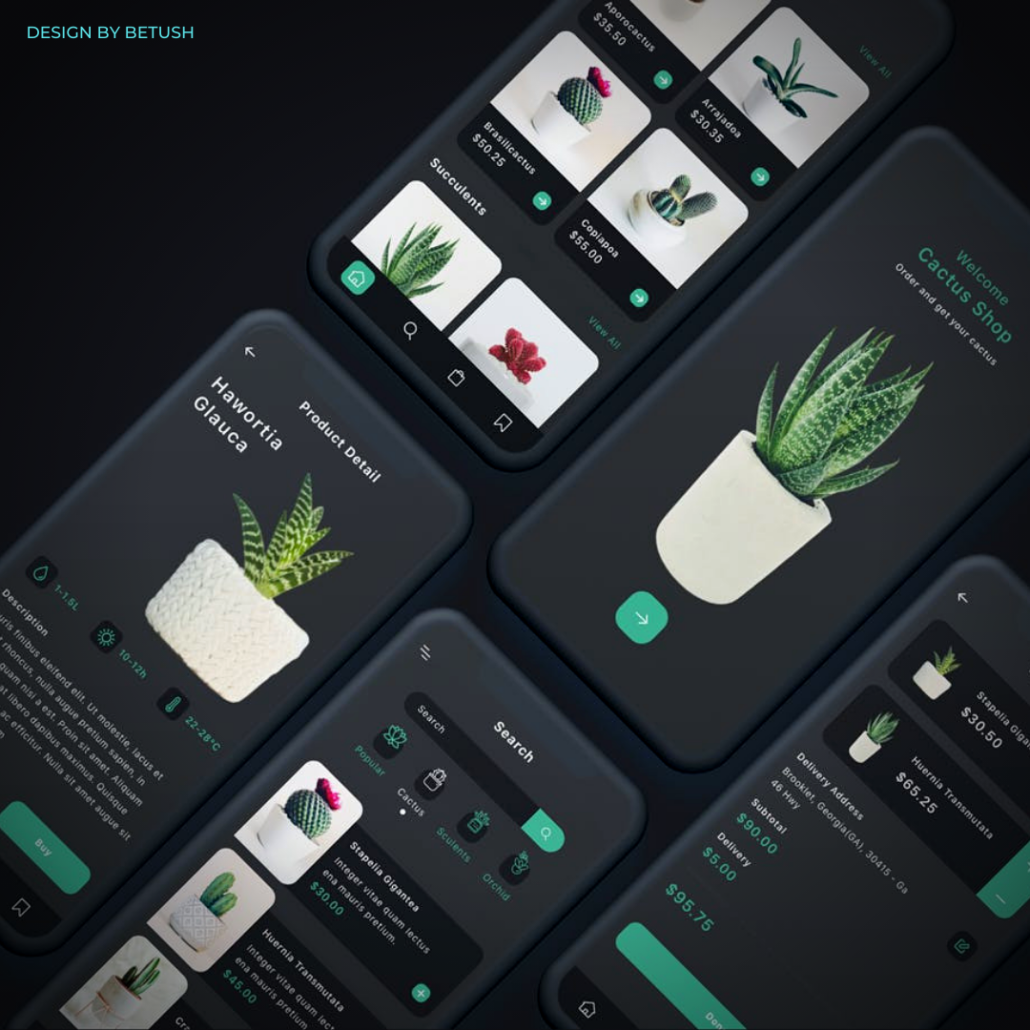
Dark mode started to take off in 2019 and has grown to be adopted by most operating systems, plugins, apps, some websites and even made its way into print.
But why has it taken the UX and UI worlds by storm? Well besides the inherent cool factor of being dark and moody, fonts and elements stand out significantly more on a dark background, increasing the accessibility for sight-challenged people. While these are good enough reasons alone, there are a few more that should grab your attention.
Cheers to Your Health
With the vast amount of time we spend on screens, the option to give your eyes a break is a coveted concept. Bright screens create stress and strain on eyes that can result in dry, tired eyes and lead to a suppressed production of melatonin, affecting sleep. Dark mode can alleviate these issues by reducing the total amount of white light your eyes process over the course of a day. Particularly in darker environments, dark mode is more relaxing on the eyes.
Extend Your Battery Life
Using dark mode on devices significantly increases battery life. Depending on what level of brightness your screen is at, you can save between 15% and 60% of your battery compared to screens viewed in bright white. While it’s nice to go further between charges, this can be extremely useful in emergency situations when your phone is your lifeline.
Captivate Your Market
For the same reasons Dark Mode increases accessibility for sight-challenged people, the contrast of fonts and elements on a dark background are attention-grabbing for any user. But we all know it’s not just about grabbing attention, it’s holding it as well. Some research has shown that utilizing a dark theme increases the length of user engagement, meaning more interaction with your site. This makes dark mode a potentially excellent tool to captivate the attention of prospective users.
Top Tips for Dark Mode
Here are some of our top tips when it comes to incorporating dark mode:
- Avoid Pure Black – First and foremost, be sure to avoid pure black as the primary surface colour. A dark grey, such as colour code #121212, is easier on the eyes.
- Bold Doesn’t Mean Bright – Avoid the halo effect of pure white text on a black background by using a darker white font. This results in greater contrast and a more bold appearance.
- Don’t Over Saturate – When it comes to the colour saturation of text and graphics, dial it down when working with a darker background. The most visually pleasing colour range is between 200 and 50.
Curious if your business can benefit from incorporating dark mode into your brand strategy? Book a consultation at Cloud9 Marketing today!

