Horror in Design: The Most Terrifying Branding Mistakes
It’s October, and while you’re getting ready for all things spooky, there’s one type of horror you want to steer clear of—horrific branding mistakes! In the world of marketing, some blunders are so cringeworthy they might as well belong in a horror movie. So, grab your popcorn and buckle up, because today, we’re venturing into the darkest depths of branding fails that left a lasting mark (and not the good kind) on some pretty big companies.
1. Tropicana’s Disastrous Redesign (2009)
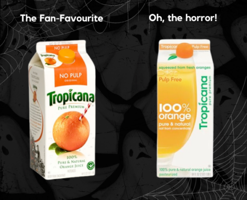
Tropicana thought it would be fun to give their packaging a fresh, modern look in 2009. Unfortunately, this well-intentioned makeover turned into a complete horror show. They ditched their iconic orange with a straw poking out for a minimalist design that left consumers scratching their heads. The backlash was swift and brutal—sales plummeted by 20% in just a few weeks, costing the company a whopping $30 million. The horror was so great they had to retreat and bring back the old design. Moral of the story? If it ain’t broke, don’t fix it!
2. The Gap’s Ghastly Logo Change (2010)

Ah, The Gap—known for its classic American style and… a logo change that went down in flames. In 2010, they decided to switch things up with a new logo: plain Helvetica font with a tiny blue square. The reaction? Fans of the brand were horrified! The new design was slammed as cheap and generic, leading to such an uproar that The Gap scrapped it just one week later. A spooky reminder that even a well-established brand can stumble by not respecting its customers’ emotional ties to its identity.
3. Pepsi’s Endless Rebranding Cycle (2008-Present)
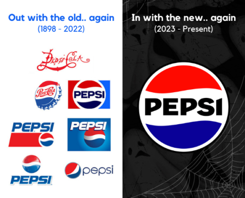
Pepsi seems cursed with an insatiable need to rebrand every few years, and the results are rarely a treat. The last redesign—featuring a “smile” on the logo—came with a jaw-dropping price tag of $1 million and was met with a collective yawn. Pepsi has since resurrected one of its old logos, bringing them back from the dead with a bold 2023 redesign. This new look is a clear homage to Pepsi’s century-old logos. As for the lowercase logo, it will be buried alongside the rest of Pepsi’s retired designs in the logo graveyard. And who knows, potentially raised from the dead to walk in the branding world yet again. Meanwhile, Coca-Cola has kept a steady, consistent brand image that stands the test of time. The takeaway here? When it comes to branding, sometimes it’s better to be a Coca-Cola than a Pepsi. Consistency is key!
4. The American Red Cross’ Drunken Tweet (2011)
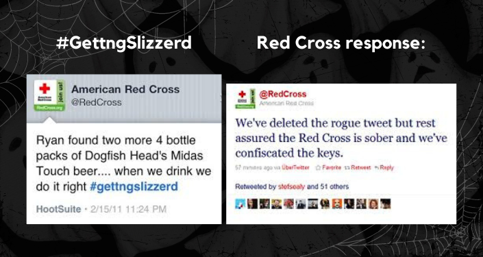
You’d think a venerable organization like the American Red Cross would be immune to social media slip-ups, right? Think again! In 2011, an employee accidentally posted a tweet meant for their personal account, revealing they were “getting slizzered” (a.k.a. drunk) on Dogfish Head beer. Although the tweet was quickly taken down, it was too late—the internet had already grabbed hold of the gaffe. Thankfully, the Red Cross handled the mishap with humor and grace, even partnering with Dogfish Head to turn the embarrassment into a charitable opportunity. Lesson learned: Always double-check which account you’re posting from!
5. Schweppes’ “Il Water” in Italy (1990s)

Sometimes, translation errors can be more horrifying than a haunted house. Case in point: Schweppes. When launching their tonic water in Italy, they didn’t realize their product name would translate to “Schweppes The Toilet.” Unsurprisingly, Italian sales didn’t quite bubble over as planned so they quickly changed the name to Tonica instead. This blunder is a solid reminder of the importance of doing your homework, especially when expanding into international markets!
So, what have we learned from these branding horror stories? Always do your homework—whether it’s testing a new design with your audience, considering cultural and linguistic differences, or simply double-checking before you hit ‘send’ on social media. Branding is not just about looking good; it’s about resonating with your audience, building trust, and standing out for the right reasons. Don’t let your brand be the next one haunting the marketing halls of shame. Remember, a little extra caution can keep your brand from becoming a real-life nightmare!
–
Feeling a little spooked about your brand’s direction? Don’t worry, you don’t have to face the marketing monsters alone! At Cloud9 Marketing, we specialize in turning your brand from a scary story into a fairy tale success. Whether you’re worried about a redesign that didn’t quite land or a campaign that’s giving off ghostly vibes, our team is here to help! Reach out to us for a free consultation, and together, we’ll ensure your brand shines brighter than a jack-o’-lantern on Halloween night. No tricks, just treats 🎃👻
Get in touch with us today, and let’s take the fright out of your marketing!


