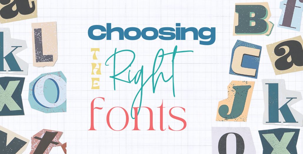
Choosing the Right Fonts
Selecting the right font is more than just a design choice—it’s a crucial element that impacts readability, aesthetics, and the overall effectiveness of your project. At Cloud9 Marketing, we understand the importance of typography in creating compelling designs. Here’s a comprehensive guide to help you choose the perfect font for your next project.
Key Factors in Font Selection
When choosing a font, consider the following factors to ensure it aligns with your project’s goals and audience:
- Readability:
- Importance: The primary purpose of any text is to be read. Ensure your font is legible in various sizes and on different devices.
- Tip: Test your font in different sizes and formats to see how it performs.
- Tone and Style:
- Importance: Fonts convey emotions and set the tone for your content.
- Tip: Match your font style with the message you want to convey. For instance, a formal report may require a serif font, while a tech blog might benefit from a sleek sans-serif font.
- Versatility:
- Importance: Your font should work well in various contexts, whether it’s in a headline or body text.
- Tip: Choose a font family with multiple weights and styles for flexibility.
- Compatibility:
- Importance: Ensure your font works well with other design elements.
- Tip: Pair fonts carefully. For example, combine a serif font with a sans-serif for a balanced look.

Understanding Font Categories
Fonts are broadly categorized into several types, each with its unique characteristics and appropriate usage scenarios:
- Serif Fonts:
- Description: Serif fonts have small lines or strokes regularly attached to the end of a larger stroke in a letter or symbol.
- Common Uses: Print media, formal documents, traditional websites.
- Examples: Times New Roman, Georgia.

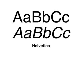
- Sans-Serif Fonts:
- Description: Sans-serif fonts lack the small projecting features called “serifs” at the end of strokes.
- Common Uses: Digital media, modern websites, minimalist designs.
- Examples: Arial, Helvetica.
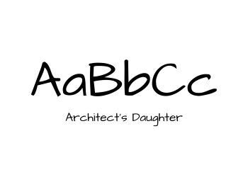
- Script Fonts:
- Description: Script fonts mimic handwritten or calligraphic styles.
- Common Uses: Invitations, greeting cards, elegant or playful designs.
- Examples: Brush Script, Pacifico.
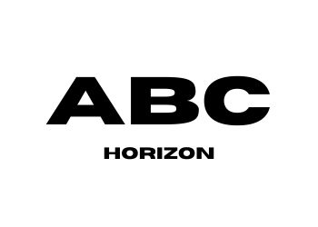
- Display Fonts:
- Description: Display fonts are designed to attract attention and are best used in headlines or short text blocks.
- Common Uses: Posters, advertisements, banners.
- Examples: Impact, Horizon.

Practical Tips for Choosing Fonts
- Limit Your Choices:
- Avoid using too many fonts in one project. Stick to two or three complementary fonts to maintain a clean and cohesive look.
- Consider Hierarchy:
- Use different fonts to establish a visual hierarchy. Headlines, subheadings, and body text should each have distinct styles to guide the reader’s eye.
- Test in Context:
- Before finalizing, test your fonts in real-world scenarios. Create mockups to see how your text looks in its intended environment.
- Check Licensing:
- Ensure the fonts you choose are licensed for your intended use, especially for commercial projects.
Summary
Choosing the right font can significantly impact the effectiveness of your project. By understanding different font categories and considering factors like readability, tone, and compatibility, you can select fonts that enhance your design and communicate your message effectively.
At Cloud9 Marketing, we specialize in helping businesses create visually stunning and effective designs. If you need assistance with your next project, contact us today.
Happy designing!


