2026 Graphic Design Trends

As we transition into the new year, graphic design trends for 2026 are becoming more intentional, refined, and human. Brands are stepping away from overly complex visuals and choosing design that feels clear, confident, and easy to understand is becoming less about showing off and more about communicating clearly. Businesses are moving away from busy visuals and short-lived aesthetics. Instead, they’re choosing design that feels intentional, polished, and easy to understand.
This makes sense. People scroll quickly, skim content, and make decisions fast. If your graphics are confusing or inconsistent, your message gets lost. The strongest brands in 2026 aren’t trying to do everything at once. They’re building visual systems that are clear, consistent, and recognizable across every platform.
In this post, we’ll walk through the top graphic design trends for 2026 and share practical ways to use them—without overcomplicating your brand.
Why Graphic Design Trends Matter in 2026
Graphic design is one of the fastest ways to shape first impressions. It impacts how professional your business looks, how quickly someone understands what you offer, and whether your brand feels trustworthy.
Strong design helps you:
- communicate quickly
- look current and credible
- build trust with potential customers
- improve readability and accessibility
- create brand recognition over time
In 2026, the goal isn’t decoration. It’s communication. Great design should feel effortless to your audience, even if a lot of strategy went into it.
Top Graphic Design Trends for 2026

1) Elevated Minimalism
Minimalism is still popular, but it’s becoming more refined. Instead of plain or empty designs, elevated minimalism uses spacing, balance, and strong typography to create a clean, confident look.
Why it works:
Minimal layouts reduce distractions and help people focus on what matters. They also make your visuals easier to scan on mobile, which is where most people see your content first.
How to use it:
- simplify social templates and reduce extra elements
- clean up your website layout and navigation
- use fewer design “effects” and more intentional spacing
- keep each graphic focused on one clear message

2) Bold Type + Big Headers
Typography is becoming a major design feature in 2026. More brands are leading with large headlines, high contrast fonts, and text-forward layouts. This is especially noticeable in social ads, website hero sections, and carousel posts.
Why it works:
Bold typography gets attention quickly and makes your brand feel confident. It also improves readability, which supports better engagement and stronger conversions.
How to use it:
- build posts around short, strong headlines
- choose one headline font that reflects your brand personality
- update your website headers to feel more modern
- use type as the main visual, not just supporting text
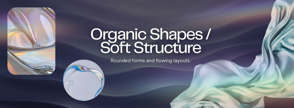
3) Organic Shapes / Softer Structures
Another big shift in 2026 is softer structure. Rounded corners, hand-drawn details, and irregular shapes are being used to add warmth and personality. This creates a more human look, even for professional brands.
Why it works:
Organic elements feel approachable. They can make your brand look friendlier and less rigid, which is especially useful for local businesses that rely on trust and relationships.
How to use it:
- use rounded corners on buttons, images, and design blocks
- add subtle abstract shapes behind text
- soften website sections with curved edges or gentle overlays
- include small hand-drawn accents—without cluttering your layout
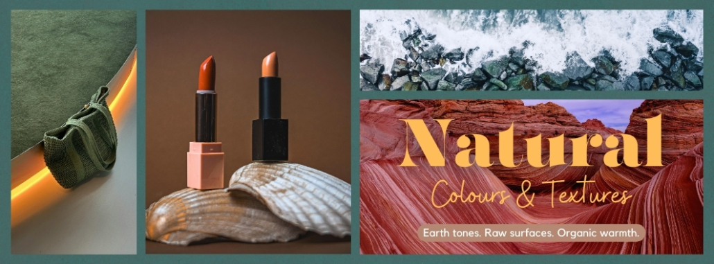
4) Nature-Inspired Palettes and Subtle Texture
Earth tones and natural colours continue to play a major role in 2026 design. Think coastal neutrals, forest greens, warm beige, clay, charcoal, and muted blues. Many brands are also adding subtle texture—like grain or paper-style overlays—to make designs feel less “digital.”
Why it works:
Nature-inspired design feels stable and timeless. It also fits beautifully with brands in outdoor communities like Whistler and the Sea-to-Sky, where people naturally connect with the environment.
How to use it:
- refresh your palette with grounded tones that match your brand
- use texture lightly so your design stays clean
- stay consistent across social, website, and print
- make sure text remains readable over textured backgrounds
Accessibility reminder:
When adding texture or imagery, contrast still matters. Text should be easy to read, especially on mobile and for people with visual impairments.
How to Use 2026 Design Trends Without Rebranding
You don’t need a full brand overhaul to stay current. In most cases, the smartest move is a strategic refresh.
Here are a few ways to do that:
- Update templates instead of rebuilding everything
Refresh your social layouts, ad graphics, and print pieces while keeping brand consistency. - Start with typography
Updating fonts and hierarchy can make your brand feel modern immediately. - Test trends on social first
Try new colours or layouts in a few posts before applying changes across your whole website. - Keep your system consistent
Trends should support your brand, not replace it. Consistency is what builds recognition.
Your Brand, Refreshed
The best graphic design trends for 2026 are focused on clarity, connection, and long-term brand strength. Elevated minimalism, bold typography, soft organic shapes, and nature-inspired palettes are all trending because they help brands communicate better.
If your marketing visuals feel outdated or inconsistent, a few intentional updates can make a huge difference. You don’t need to chase every trend—you just need a design system that looks current, feels clear, and supports your goals.
At Cloud9 Marketing, we help local businesses in Whistler and the Sea-to-Sky Corridor build strong, modern branding across web, social, print, and digital advertising. If you want your visuals to feel more polished and consistent in 2026, we’re here to help.
👉 Book your free consultation today and let’s bring your brand into 2026 with design that looks modern, feels aligned, and performs better.


")

