Productivity is personal. Whether you’re looking for a way to take better notes or track your hours at work, it’s time to take advantage of technology to do more in less time. You don’t have to look any further than your computer or smartphone to make simple and easy improvements for both in the office and at home.
Here are five apps that increase productivity in your everyday life:

How we use it: Project management
Why we love it: Hive’s productivity platform is one of the best project management tools on the market. Team members can check their to-do lists, communicate with one another in real-time, collaborate on schedules, share files, and check up on the latest project progress. When synced with Hive’s desktop and web applications, the mobile app provides yet another way to improve work ethic and productivity throughout the day.
Cost: Free to download. Hive Teams begins at $12/month per user.
Hive Solo is free forever for up to 2 users.
Download For: iOs, Android / Desktop

How we use it: A time-management app that’s a great choice for small teams
Why we love it: Todoist is a simple task manager app that allows you to record and group tasks together based on projects. Todoist provides functionality in time management and to-do lists, with an element of project management. Despite its multiple features and uses, the tool remains easy to use. This makes collaborating with teams over multiple projects a breeze, and for us, visual learners; shows deliverables at a glance.
Cost: Free for the basic version (limited projects)
Premium version is $3.99 monthly or $35.99 annually
Download For: iOS, Android, Mac / Windows Desktop

How we use it: Collaborating on documents
Why we love it: Google Docs is one of the best tools for sharing documents and collaborating in real-time. This online word processor eliminates the need to save and send files back and forth when writing and editing a document. Depending on your settings, projects can be shared inside and outside of your organization. Google Sheets has similar benefits, such as the ability to import CSV into Google Sheets, which lets you keep all of your documents in one online hub.
Cost: Free
Download For: iOS / Android

How we use it: Social Scheduling
Why we love it: Sprout Social is a comprehensive tool that lets companies schedule posts and campaigns across all of their social channels. View all the planned posts in a single comprehensive calendar, which is extremely helpful for aligning your campaigns, organizing your social media channels, and seeing the bigger picture. This format allows for easy communication between channels in the inbox, as well as access to post analytics.
Cost: Free 30 day trial.
The professional plan starts at $89 per month for 5 accounts managed by one login. Prices go up from there.
Download For: iOS / Android
Now it’s time to give your customer a name and a face. This might be strange, but it will help crystalize the idea of the ‘human’ you will later create content and other marketing materials for. Browse through stock images and see if you can find a picture to associate with him. Do not use images of actual people, find AI-generated images of faces for privacy purposes. Try browsing https://generated.photos/ for ideas.

How we use it: Storing and managing passwords
Why we love it: How much time do you waste every day manually signing into various accounts and searching for forgotten passwords? Last Pass is a password management app that stores all of your digital passwords in one place, making it easy to log into all of your various accounts while also keeping your digital information secure. Last Pass uses a browser extension to keep information secure on your computer, and their mobile app is a life-saver for people who are constantly on the move.
Cost: Last Pass has a free plan, but it does not include syncing across all devices.
Premium plans start at $3/month for personal use and $4/month for business teams.
Download for: Browser extension / iOS / Android
If productivity and marketing strategies have left you scratching your head, contact us for a free one-hour consultation. We are even more productive in person! Let Cloud 9 take your project to the next level!
How Good UX is Designing a Better Future for Online Shopping
As online shopping continues to grow, so does the importance of having a good user experience (UX) design. From navigating complex web pages to providing customers with the best possible product and service options, UX designers are creating a better future for online shopping.
Good UX design helps customers find the products and services they need more quickly and efficiently while providing them with an enjoyable shopping experience. UX design can also offer customers personalized product recommendations and tailored information, helping them make more informed decisions.
Good UX design can lead to higher conversion rates for businesses, as customers are more likely to complete a purchase when their experience is pleasant and intuitive. UX designers also create a better shopping experience for customers by ensuring websites are secure, fast, and user-friendly.
Good UX design is also helping to make the future of online shopping more sustainable. By providing customers with personalized product recommendations, businesses can reduce their carbon footprint and help conserve resources. Designers are also focusing on creating more efficient shopping experiences requiring less energy and resources.
The future of online shopping is being shaped by UX designers creating better experiences for customers and businesses alike. By focusing on creating more efficient, user-friendly websites, designers are helping to create a brighter future for online shopping.
The Impact of AI on Digital Marketing
AI is quickly becoming one of the most powerful tools in the digital marketing world, and its use for content development is becoming increasingly popular. AI analyzes existing content, generates new content, and optimizes content for search engine rankings. In this blog post, we’ll explore how AI is used for content development and how it can impact digital marketing.
First and foremost, AI can analyze existing content and determine where it can be improved. This is done through natural language processing. It uses AI to understand the scope and identify how it can be improved, from grammar and spelling to more complex analysis, such as keyword optimization. This analysis can help marketers ensure their content is of the highest quality and is optimized for search engine rankings.
AI can also be used to generate new content. AI-driven bots, such as chatbots and virtual assistants, can create unique, engaging content for websites, social media, and other platforms. These bots can understand natural language and generate content tailored to users’ needs. For example, a virtual assistant could generate FAQs based on customer questions and provide relevant information.
Finally, AI can be used to optimize content for search engine rankings. AI-driven tools such as Google Rankbrain can analyze existing content and suggest changes that can improve its search engine rankings. This can help marketers ensure their content is seen by the right audience and drives more organic traffic to their website.
Overall, AI is revolutionizing how we create content, and its use for content development is becoming increasingly popular. AI can help marketers analyze existing content, generate new content, and optimize content for search engine rankings. This can help marketers ensure their content is of the highest quality and is seen by the right audience. AI is quickly becoming a powerful tool in digital marketing, and its use for content development will only grow in the future.
2022 Graphic Design in Review
Every year, we see certain graphic design trends rise to popularity, and others barely gain traction. As we move into this hungry post-pandemic world, styles from across the decades are being given a second life. If you’re looking to stay ahead of the curve in the world of branding design, it’s important to know which trends are on the rise.
Here are four design trends to inspire your next creative project:
1. Childhood Inspired 90’s Vibes
Let’s go back in time to 90s graphic design for an aesthetic inspired by MTV, 90’s rave parties, Saved by the Bell, bold colour blocks and your family’s first computer. Millennials in particular will feel drawn to these nostalgic digital playgrounds. The typefaces in this decade were eye-catching, to say the least. They were characterized by a sense of not taking themselves too seriously. Perhaps this playful approach had something to do with the Comic Sans MS font, which debuted in October 1994. Its sans-serif script aesthetic captured the carefree approach of the decade.
2. Warm and Fuzzy Candy Colors
There are so many ways to ensure that a design is visually appealing and will stand out. Using Candy colours in your designs evokes a playful, youthful vibe. They work particularly well in 3D illustrations and character design. Understanding colour theory is central to knowing the right way to create bold and striking designs with candy colours. Triadic colour palettes will capture your audience’s attention, whether your tool of the trade is web design, animation, illustration, or typography.
2. No More Rules With Anti-Design
Whether you love it or hate it, in 2022, you’re sure to start seeing designs that are liberated from traditional design principles. Anti-design is an expression of rebellion – bending, stretching, and re-interpreting the rules of graphic design. The idea runs parallel to the rise of the ‘ugly’ aesthetic in furniture, product, and fashion design. Anti-design requires real confidence and skill, ironically.
3. The Human Touch With Doodle Desing
These meandering drawings inject a feeling of bespoke individuality to a sea of sameness. Doing so can bridge the gap between digital tools and the human touch, creating designs that are approachable. Doodle makes your story both powerful and comical. By combining, you have a compelling comic narrative to pique the audience’s interest.
4. Bring Stories To Life With Motion Graphics
The world of motion graphics has experienced a big boost over the last few years. While in-person events took a hit throughout the global pandemic, video creators turned to stock footage and animation and began experimenting with motion graphics to come up with fresh ways of delivering content. From subtle in-app motion graphics to looping gifs and animated collages, motion draws attention and brings stories to life.
Have fun with design. If you are looking for help harnessing new techniques, we at Cloud 9 would be happy to get involved! For help with services like digital marketing, SEO, and content creation, contact us for a free one-hour consultation today.
5 Ways to Increase Web Traffic In Searches
Why is everyone soo excited about SEO? Search Engine Optimization (SEO) is crucial because it makes your website more visible, and that means more traffic and more opportunities to convert prospects into customers. If you’re concerned about the way your business’s website is performing, try these 5 tips to improve your position on the search engine results page (SERP).
Here are five things you can do now to improve your website’s SEO rankings:
1. Publish Quality Content
Having high-quality content on your website is one of the best ways to increase traffic and improve your search rank. Authoritative content is the number one driver of your search engine rankings and there is no substitute for great content. Fine-tune your web writing skills and present yourself as an authority on the topic you are writing about. Make sure your content is mistake-free, keyword-rich, mobile-optimized, and includes valuable links to additional internal and external content.
2. Optimize Keywords
Identify and target a specific keyword phrase for each page on your website. For the best results, front load the keywords in the Tile of the page. This guide to Keyword Research for Social Media is a good resource for determining which keywords your audience is using. Try to think about how your target reader might search for that specific page and what kind of search terms and phrases they would use:
2. Update Content With A Blog
Try writing a blog, and make new entries as much as you possibly can. Regularly updated content is viewed as one of the best indicators of a site’s relevancy, so be sure to keep it fresh. Make sure your content is mistake-free, keyword-rich, mobile-optimized, and includes valuable links to additional internal and external content.
3. Don’t Use Click Here for Links
Improve your site’s credibility and ranking by adding relevant links within the text. Instead of having “click here” links, try writing out the name of the destination. “Click here” to for more on Cloud 9’s blog has no search engine value beyond the attached URL, whereas read our blog post on How To Create A Customer Persona is rich with keywords and will improve your search engine rankings.
4. Check Your Site Speed
Load time is one of the key measurements in Google’s ranking system. If your site is slow, you have little chance of a high search position. To increase the load times of your site, check to see if images are optimized and have descriptive filenames and include alt text. Squoosh.app is a great way to optimize web images for all different applications.
5. Use Header Tags
Not only do header tags (H1, H2, H3…) break up content and provide better visual hierarchy and readability, they are one of the most important ranking factors in SEO. Over the years, SEO has become much more about usability and accessibility and offering people a good user experience, rather than just hitting all of the right technical requirements. Read this article on how to properly use header tags to learn more. Unlike an HTML Title tag, an H1 tag doesn’t tell search engines what to display. However, it does affect user experience, which is important for SEO.
Good SEO involves many different techniques. We at Cloud 9 hope this list has helped shine some light on the ways you can improve your website’s SEO. For help with services like digital marketing, SEO, and content creation, contact us for a free one-hour consultation today.
Productivity Apps To Get Things Done
Productivity is personal. Whether you’re looking for a way to take better notes or track your hours at work, it’s time to take advantage of technology to do more in less time. You don’t have to look any further than your computer or smartphone to make simple and easy improvements for both in the office and at home.
Here are five apps that increase productivity in your everyday life:
1. Hive
How we use it: Project management
Why we love it: Hive’s productivity platform is one of the best project management tools on the market. Team members can check their to-do lists, communicate with one another in real-time, collaborate on schedules, share files, and check up on the latest project progress. When synced with Hive’s desktop and web applications, the mobile app provides yet another way to improve work ethic and productivity throughout the day.
Cost: Free to download. Hive Teams begins at $12/month per user.
Hive Solo is free forever for up to 2 users.
Download For: iOs, Android / Desktop
2. Todoist
How we use it: A time-management app that’s a great choice for small teams
Why we love it: Todoist is a simple task manager app that allows you to record and group tasks together based on projects. Todoist provides functionality in time management and to-do lists, with an element of project management. Despite its multiple features and uses, the tool remains easy to use. This makes collaborating with teams over multiple projects a breeze, and for us, visual learners; shows deliverables at a glance.
Cost: Free for the basic version (limited projects)
Premium version is $3.99 monthly or $35.99 annually
Download For: iOS, Android, Mac / Windows Desktop
3. Google Docs
How we use it: Collaborating on documents
Why we love it: Google Docs is one of the best tools for sharing documents and collaborating in real-time. This online word processor eliminates the need to save and send files back and forth when writing and editing a document. Depending on your settings, projects can be shared inside and outside of your organization. Google Sheets has similar benefits, such as the ability to import CSV into Google Sheets, which lets you keep all of your documents in one online hub.
Cost: Free
Download For: iOS / Android
4. Sprout Social
How we use it: Social Scheduling
Why we love it: Sprout Social is a comprehensive tool that lets companies schedule posts and campaigns across all of their social channels. View all the planned posts in a single comprehensive calendar, which is extremely helpful for aligning your campaigns, organizing your social media channels, and seeing the bigger picture. This format allows for easy communication between channels in the inbox, as well as access to post analytics.
Cost: Free 30 day trial.
The professional plan starts at $89 per month for 5 accounts managed by one login. Prices go up from there.
Download For: iOS / Android
5. Last Pass
Now it’s time to give your customer a name and a face. This might be strange, but it will help crystalize the idea of the ‘human’ you will later create content and other marketing materials for. Browse through stock images and see if you can find a picture to associate with him. Do not use images of actual people, find AI-generated images of faces for privacy purposes. Try browsing https://generated.photos/ for ideas.
How we use it: Storing and managing passwords
Why we love it: How much time do you waste every day manually signing into various accounts and searching for forgotten passwords? Last Pass is a password management app that stores all of your digital passwords in one place, making it easy to log into all of your various accounts while also keeping your digital information secure. Last Pass uses a browser extension to keep information secure on your computer, and their mobile app is a life-saver for people who are constantly on the move.
Cost: Last Pass has a free plan, but it does not include syncing across all devices.
Premium plans start at $3/month for personal use and $4/month for business teams.
Download for: Browser extension / iOS / Android
If productivity and marketing strategies have left you scratching your head, contact us for a free one-hour consultation. We are even more productive in person! Let Cloud 9 take your project to the next level!
How customer personas help define your target audience
If you can understand your top customers, you will be able to pinpoint their business pains, understand how they communicate and get on the right platforms to attract their attention.
It’s impossible to find out everything about every customer or prospect individually, but you can create a customer persona to represent your customer base.
A customer persona is a detailed description of someone who represents your target audience. This persona represents one fictional customer, not a group of people.
How To Build A Customer Persona
Have a look at who is already buying from you, following you, and interacting with your posts. When painting this picture of your target audience, note the following data points (with examples):
Age: Millennial / 38
Marital Status: Long Term Partner
Gender: Female
Education: BCIT E-Commerce
Children: None
Income: $90,000.00
Occupation: Project Manager
Personality: Ambivert
Home Ownership: Townhouse Owner
Start With Demographics
Basic demographics will help create a starting point for your persona. Try and provide as much detail as possible based on your market research.
Where in the world does your social media audience live? This helps you understand which geographic areas to target. Does your target audience include college students? New parents? Parents of teens? Retirees?
Psychographics Add Personal Detail
Next, psychographic data, such as interests and hobbies add more personal details to help form a better understanding of your customer prospects.
What does your target audience like to do? What TV shows do they watch? What other businesses do they interact with? What are the personal and business challenges they face in a day?
Understand Spending Behaviors
Finally, defining the users spending power and patterns allows us to understand purchasing behavior and estimated retail spending.
How much money does your target audience have to spend? How do they approach purchases in your price category? Do they have specific financial concerns or preferences you need to address? Do they purchase on the spot or take time to research before a purchase?
Put A Face To The Name
Now it’s time to give your customer a name and a face. This might be strange, but it will help crystalize the idea of the ‘human’ you will later create content and other marketing materials for. Browse through stock images and see if you can find a picture to associate with him. Do not use images of actual people, find AI-generated images of faces for privacy purposes. Try browsing https://generated.photos/ for ideas.
Paint A Picture With All The Parts
It’s time to gather all the data in one place and breath some life into this person. Create a short bio or “life story” for your customer persona. Explain how they have come to need your help. Many businesses have more than one customer segment they want to reach. Create a different customer persona for each of these segments.
The better you understand your target market, the more you’ll be able to focus ads and reach people who are most likely to convert into customers. This customer research will help you create resonating content, messaging, and ads. The next time you need to ask the question, “What does my customer want?”, ask your persona. Going through this process will give you valuable insights into how to create content that resonates with your target audience.
Top Design Trends of 2021: Year in Review
This year we embarked on a journey through the top design trends of 2021. We carefully selected trends that were being heavily utilized for UX, UI, social media, websites, and branding. Each month we did a deep dive on our social channels, carefully creating and curating graphics that portrayed the design concepts. If you didn’t happen to see the entirety of the collection, we wanted to share with you a high-level overview of this past year. Of course, if you want more, take a browse through our 2021 blog posts to get a more in-depth look at each trend. Or… just scroll.
Dark Mode
Dark Mode took the UX and UI worlds by storm this year. Besides the obvious cool factor of being dark and moody, this trend excelled because its fonts and elements stand out significantly more on a dark background, increasing the accessibility for sight-challenged people. While this is a good enough reason alone, there were a few more that caught our eye. Dark mode is great for captivating the attention of users, easy on the eyes (literally), and saves the battery life of your phone or tablet.
Natural Design
Natural design originally made its way into web design via eco-conscious brands. However, it made its way into the top trends of 2021 since growing in popularity across different industries. The natural imagery, calming colours, and soothing fonts aren’t just for eco-friendly companies anymore. Due to the pandemic, the past two years resulted in more of us spending more time indoors and on screens. It’s no wonder we wanted a more soothing and natural user experience online, bringing the outside in.
Monochromatic Minimalism
Monochromatic Minimalism was the cleanest design trend we highlight this year. While this style of graphic design isn’t new, over 60 years in the making, we’ve seen a huge growth in its presence today. The increased use of monochromatic minimalism in design is possibly a reflection of what users are desiring more in their own lives: simplicity. We found that not only does this speak to users, but when there’s less visual information vying for the user’s attention, what does remain has more of an impact.
Socially Conscious Design
Socially Conscious Design has been one of the most powerful design trends in recent years and had an incredibly strong presence in 2021. This design trend focuses on showing solidarity and support for social, environmental, and justice issues through graphic design. Essentially, it is artists using their talent and voice to promote the betterment of society. The need for social and environmental change has reached a tipping point in recent years, and creators and brands have stepped up to the plate to show support and create awareness.
Contemporary Boho
Contemporary Boho is a modern twist on Bohemian style. While bohemian style is known for opulence and excess, in current graphic design, the trend is dialled back a bit – accented with clean, modern lines, fonts, and empty space. The combination of the flowery excess of the bohemian style with modern touches can result in visually stunning and appealing graphics.
Duotone & Colour Monochromatic
Duotone & Colour Monochromatic has become more and more popular in recent years, and we have loved the resurgence of this throwback. This design trend implements a simple palette, but with a strong presence. This style of branding is creative, eye-catching, and customers love it.
Geometric Design
Geometric designs have been at the forefront of design trends this year and have the staying power to be around for years to come. The clean appearance of geometric shapes, coupled with the subconscious psychology of shapes, creates impactful graphic designs that connect with clients. You can learn more about the psychology behind the shapes here.
Gold
While gold has been a timeless design trend, it definitely worked its way into the ranks of the top design trends of 2021. We’ve consistently seen the rise of this trend over the years, and frankly, it’s not going anywhere. From delicate accents to elevate a brand’s sophistication to bold eye-catching metallics front and center, gold takes the cake.
Bold Design
The striking design trend of bold design stepped into the spotlight this year. Bold design is a multi-faceted design concept – it can be your messaging, colourway, typography (or absence thereof), graphics or photography. Bold Design isn’t simply eye-catching graphics or typography – the essence of bold design is captivating creatives and tactics that not only catch the eye of the user but hold their attention.
Typographic Chaos
Typographic Chaos might be the most symbolic trend for this past year. It perfectly embodies the chaotic nature of 2021, but at the same time, provides beauty, creativity, and inspiration. This trend breaks all the rules, and we couldn’t love it more.
Keep the Chaos
Typographic Chaos might be one of the most appropriate trends for the year 2021. It perfectly embodies the chaotic nature of the past year, but at the same time, provides beauty, creativity, and inspiration. This trend breaks all the rules, and we couldn’t love it more.
Experimentation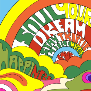
For designers who really want to flex their creative muscles, experimenting with typographic chaos is an opportunity to let your artistic flair fly. Experimentation and finding new approaches beyond traditional typographic systems is a creative way to see what moves your audience. Pushing the limits of communication by testing new ways of how an audience reacts to subject matter is truly a task for the artist.
“While clarity in design is imperative, sometimes it’s OK to put the cookies on the top shelf. Sometimes it’s OK to invite our audiences to reach a little. Their effort can reward them delight.” – Greg Breeding
Type Heavy
It almost goes without saying that Chaos Typography is well… type heavy! There may be photos or illustrations accompanying the type, but the chaotic nature of the typography’s design takes center stage. Whether disjointed, bubbly, 3D, or simply chaotic, the typography is the main focal point of the design, and it’s what draws the viewers in.
Breaking the Rules
The Royal Albert Hall by Alan Kitching
Typographic chaos throws classic rules of graphic design and typography out the window. Breaking the rules is part of what makes this design trend so fun – opening up your creative and artistic ability to design something so eye-catching, your audience will want to take the time to pause, deconstruct it, and take it all in. Chaos typography doesn’t stick to hierarchy, grid system or legibility. You can utilize a lack of text and letter alignment, mix the order of letters and words, and generally, break the rules as you go.
We are even more interesting in person. Want to find out? Book in a free, one-hour consultation to see how we can take your project to the next level!
Be Bold, Not Boring
Not Your Grandma’s Gold
Gold is timeless for branding, and the modern-day application of it is definitely not your grandma’s gaudy gold. We’ve consistently seen the rise of this trend over the years, and frankly, it’s not going anywhere. From delicate accents to elevate a brand’s sophistication to bold eye-catching metallics front and center, gold takes the cake. This versatile trend isn’t the easiest to implement, so Grandma, put your spectacles on and read carefully!
Gold, Not Yellow
Let’s start with the biggest pain point designers face – gold doesn’t mean yellow. Achieving gold in your branding isn’t an easy task, and we highly recommend professionals (ahem, nice to meet you) to take on this challenge. When looking through different examples of gold in branding, you’ll likely notice the heavy presence of photography, images and textures used. Recreating gold in design can easily turn flat and simply appear yellow, with no hint of metallic. If you’re desperate to try it yourself, we’ve found that a web-friendly version of gold can be achieved using the hex code #D4AF37 or RGB value of 212, 175, 55. You can check out some hex code examples here.
Read the Room
While we love to rave about the beauty of gold in design, it has to speak to your audience to work well. Gold has often been a signifier of wealth and extravagance, glamour and beauty, even optimism. Just as all of these attributes can be inspirational and eye-catching, if overdone, they can quickly be internalized as greedy, excessive, and materialistic. Finding that sweet middle ground is likely where you want to be. Particularly with the state of the world today – using gold in an understated and delicate fashion will likely land the best, but of course, it all depends on your audience.
Less is More
Using gold sparingly might be the single best advice we can give. An overuse of gold can actually cheapen the look of the design, and ultimately your brand. Pairing delicate lines of gold with muted and modern palettes and graphics will give a timeless and luxurious feel, without taking things too over the top. A small dose of gold is a fantastic way to give your products a little extra-something-something (you know what we mean). One of our favourite examples of branding and packaging we created for a client is The Haven Project. You can read more about the luxury & modern branding we did here.
What Goes with Gold?
It’s not just a question for your wardrobe, but understanding how to mix and match gold is imperative to graphic design. First and foremost, it depends on what type of colour scheme will guide your project. Here are some examples:
If gold speaks to your brand, but you don’t want to get into the intricacies of designing it – let us do the leg work! You can book your hour-long, complimentary consultation here.